Why All Our Maps Are The Wrong Way Round
An Everything Is Amazing encore edition.
Hello! This is Everything Is Amazing, a newsletter about curiosity, attention, wonder and science - which is on a short break after the fifth season concluded last week (here’s what happened and here’s what’s next - plus here, too).
This post is the second part of a 6-week “the story so far”: one of twelve formerly published pieces that made a big impact when they first went out…
And in today’s rerun (originally published here), I’m going to attempt to flip your world right over. Hope that’s okay with you.
It’s 1154, and Arab geographer Muhammad al-Idrisi’s masterwork is finally complete.
For years, he’s been pouring everything he’s learned about the world into a book, the likes of which the world has never seen. A book that tries to explain exactly what the known world really looks like, to an unprecedented level of detail and accuracy, without resorting to embellishment or flights of wild fantasy.
A book of facts.
Al-Idrisi has spent more than a decade on this project. Luckily, he has a very supportive publisher: the Norman king Roger II of Sicily. It’s pretty common for travel-related books to get royal backing like this: centuries later, the adventurer Ibn Battuta, whose 72,000 mile journey (if true) makes him the greatest pre-modern world explorer, will be commissioned by the Sultan of Morocco to spend a year writing up all his adventures into a single volume.
Under these conditions, there are many incentives to embellish your travel stories. In Battuta’s case, if he fabricated accounts of being showered with lavish gifts by rulers of other countries, wouldn’t that encourage his current patron to treat him the same way? And since Battuta was the sole source here, dictating his whole journey to a scribe without having to worry about what we’d now call “fact-checking,” surely it’s an opportunity only a fool would squander? Man’s gotta eat.
In contrast, al-Idrisi seems to be treating the truth with greater reverence. For fifteen years he’s worked on this, not just finding & telling good yarns but measuring, calculating, ensuring everything fits together in a rational manner. Additionally, as a royal commission, this doesn’t just have to be a work of weighty scholarship - it has to be great Art as well, as beautiful as it is correct.
Now it’s ready. And wow, what a thing it is:
“The mechanical genius of the author was not inferior to his erudition. The celestial and terrestrial planisphere of silver which he constructed for his royal patron was nearly six feet in diameter, and weighed four hundred and fifty pounds; upon the one side the zodiac and the constellations, upon the other – divided for convenience into segments – the bodies of land and water, with the respective situations of the various countries, were engraved."
- S. P. Scott, History of the Moorish Empire (1904).
Accompanying the text is a map inscribed on a disc of solid silver, weighing 300 pounds. Upon it is wrought the whole world - presented flat here, but described inside the book itself as a sphere. (The spherical nature of the world was almost universally regarded as fact by this time - which makes you wonder what they’d make of these folk.)
Incredibly, al-Idrisi’s map was more or less accurate. Yes, many coastlines were misshapen, bulging and crumbling in ways you’d never see in modern satellite imagery - but the distances used were remarkably bang-on. Al-Idrisi calculated the circumference of the world to be 37,000 kilometres (22,900 mi). That’s less than 10% short of the correct figure - an incredible achievement for the time.
In Scott’s words:
"The compilation…marks an era in the history of science. Not only is its historical information most interesting and valuable, but its descriptions of many parts of the earth are still authoritative. For three centuries geographers copied his maps without alteration. The relative position of the lakes which form the Nile, as delineated in his work, does not differ greatly from that established by Baker and Stanley more than seven hundred years afterwards, and their number is the same.”
The title for this whole 15-year project was نزهة المشتاق في اختراق الآفاق - The Excursion of One Who is Eager to Traverse the Regions of the World.
Similarly, Ibn Battuta’s book, two centuries later, was A Gift to Those Who Contemplate the Wonders of Cities and the Marvels of Travelling.
Aren’t these titles gorgeous and enticing? It says a lot that their lowfalutin, algorithms-friendly titles these days are The Travels Of Ibn Battuta, and for al-Idrisi’s masterpiece, The Tabula Rogeriana, - which sounds great until you realise it means “The Map Of Roger”. Perhaps a bit too Monty Python for modern ears.
(The names of authors were just as spectacular. Ibn Battuta’s was, in full: Shams al-Din Abu'Abdallah Muhammad ibn'Abdallah ibn Muhammad ibn Ibrahim ibn Muhammad ibn Yusuf al-Lawati al-Tanji ibn Battuta. He must have dreaded introducing himself to strangers.)
Anyway. Let’s look at the most interesting thing about al-Idrisi’s work, because remarkably enough, we haven’t got to it yet.
Here’s the whole map, carefully reproduced in 1929 by German historian Konrad Miller:
Yep. To our eyes, Al-Idrisi’s map is upside-down.
Except, well, it isn’t. What’s actually upside-down is our thinking - because these days, we’ve fallen into the mental trap of assuming that our maps point in the “correct” direction, according to essential scientific qualities dictated to us by Nature itself.
In fact, they don’t. We’ve decided it’s correct. This way of seeing the world is a human invention. (A recent one, too.) And across the expanse of human history, it seems that millions of people saw the world very differently indeed.
Hold onto your hat. This is going to get pretty weird.
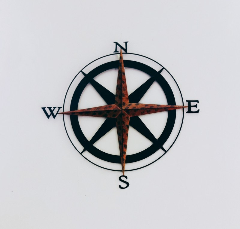
Ask someone why north is upwards on maps, and they’ll probably say something about magnetism. I mean, that’s loud and clear, right? The arrow points to the North Pole (or near as dammit), so that’s how you use a compass, and so that’s the right way to rotate a map. Duh.
It’s similar to how science determines Left and Right, which also comes from our understanding of how matter is affected by magnetic fields - and is demonstrated by “Fleming’s Right-Hand Rule,” which I still remember from school. You use your right hand to find out the direction of motion in an electromagnetic field.
There’s one problem with this:
“When we actually predict how matter moves due to magnetic fields, we use the right-hand rule twice, so it cancels out. We use the right-hand rule once when describing how a current or changing electric field produces a magnetic field, and again when describing how a magnetic field pushes on matter!"
- John Baez, mathematical physicist, University of California, quoted by Scientific American
There’s a lot of heated back-and-forth around this, but the current unstable consensus is that because of this cancelling-out, Left and Right don’t really exist. Not really. Where there’s left-handedness or right-handedness, it’s arbitrary - that is to say, there should be places in the universe where the opposite is true without breaking the universal laws of physics.
Therefore - and this is a really odd thing to think - they’re things we’ve invented, and enormously influenced by the way our bodies are designed. (Look how I used “left/right-handedness” there and I didn’t even mean using hands.)
Our concepts of North and South are just as arbitrary. They don’t exist separately from us. We chose them.
To illustrate this, let’s start with magnetism. The first mention of a compass being used in Europe is from a book written between 1187 and 1202 AD, by the scholar & later abbot of Cirencester Abbey, Alexander Neckam:
“…they touch the magnet with a needle, which (the needle) is whirled round in a circle until, when its motion ceases, its point looks direct to the north…”
The first mention of a compass in the Muslim world? Around 50 years later. And Asia? Yep, China had them too - except around a thousand years earlier. Specifically, during the Han Dynasty period (206 BC - 220 AD).
Have you ever seen a Han Dynasty compass? They’re…memorable.
That’s right: the ancient Chinese navigated with spoons.
Except, not really. These weren’t navigation tools, although they used exactly the same operating principles as modern compasses. Instead, this was about divination, the quest for the most feng shui way of arranging your surroundings - and therefore your life - for optimal harmony.
(It seems they also had a secondary use by jade hunters to stop them getting lost - so even this far back, they were already being used to navigate in the modern way.)
The name of these Han Dynasty compasses is the next twist in our tale. It translates as “The South-Pointing Spoon.” To them, the “top” of a compass (the neck of the spoon) pointed towards what we know as the South magnetic pole. After all, a compass just aligns itself with the Earth’s magnetic field. It’s humans who decide which way it’s pointing.
If South-Pointing Spoons were the determining factor in orientation, a thousand years of Chinese maps might have had the south at the top. Instead, Chinese cartographers pointed maps the other way, like we do. Here’s why:
“In Chinese culture the Emperor looks south because it’s where the winds come from, it’s a good direction. North is not very good but you are in a position of subjection to the emperor, so you look up to him.”
Presumably if he had been based in the south of China, the reverse would have become true - and maybe there’s a good chance that any medieval Europeans copying Chinese navigation techniques would have learned to orient their maps with south at the top…
But no. It looks like it’s because an Emperor chose to live in one place rather than another. It’s that random-sounding.
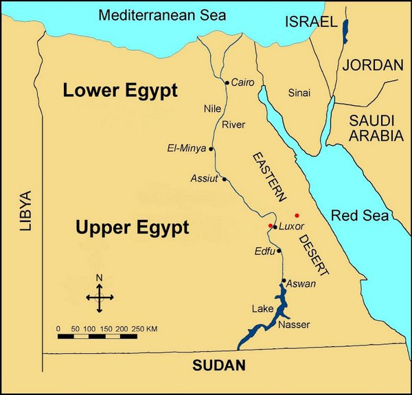
No such confusion in ancient Egypt. Their south-facing preference is still visible on modern maps: “Upper Egypt” is down the map, while “Lower Egypt” is where the Nile empties into the Mediterranean.
This was entirely logical. Surely the “upper” part of a river is where it flows from, because water only flows downhill, right? (What kind of camel-trampled fool would argue that water flows upwards?)
Look elsewhere in the world, and you find it turns into a cartographic free-for-all. I’m not even going to get started on the number of early European medieval maps where East was depicted as upwards. (Reason: it put the Holy Land at the top.) And let’s not dwell on how some explorers drew their charts pointing in the direction they were going, sometimes without any attempt to add any other…oh, I give up.
Speaking of sailors, there is one final glimmer of hope for an objective, Nature-determined explanation to all this - and it hangs in our skies every night.
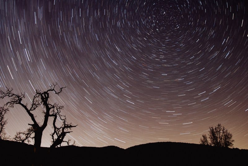
Polaris, better known as the North Star, is incredibly easy to find. Look up on a cloudless night and find the seven stars of the Plough or The Big Dipper - the constellation that’s shaped like a pan, or perhaps a spoon.
The two stars at the end facing back towards the “handle” are Merak and Dubhe (the latter’s actually a binary star - it just blurs into a single bright point at the distance we’re at). And if you trace an imaginary line from Merak to Dubhe and keep going, it’ll hit Polaris - which hovers in exactly the direction we now call North.
This “Star Of The Sea” or “Lodestar” is rightly famous for what it did for seagoing navigation. Its impact on European mapmaking cannot be understated - and probably had a lot to do with the orientation of Mercator’s influential World Map (1569), which nailed north to the top of European maps for good.
But what about previous ages? For example, were those ancient Chinese spoon-compasses referencing the shape of the Big Dipper - maybe suggesting that Han-Dynasty scholars also relied on Polaris in some way? Is Polaris therefore an unchanging point we could all agree on, no matter where and when we are?
Alas, this falls apart if you look back into human history. Because of precession (the gradual change in the Earth’s rotational axis over time, like the wobble in a spinning top), Polaris hasn’t always been in the same place in the sky. It’s only by the 12th Century AD that it became workable for accurate navigation…and 2,000 years from now, the tilting of the Earth will have knocked it out of its present position once more.
Also, Polaris is just one of a number of pole stars through history. Our current South Star is Polaris Australis - rather dimmer than its northern counterpart, and a little off our southern celestial pole. But it’s usable. (If you can see it and point to it, that’s more or less South.)
But it’s only useful to us right now. A couple of thousand years ago, we had different pole stars at either end - and after a few milennia from now, we’ll have more new ones. They tend to wander in and out over time.
And remember, depending on the period of history, this would be seen less as “the precession of the Earth” and more “wow, look at that star that hardly ever moves! What’s it trying to tell us?” Try imagining the number of ways that could be interpreted by fertile imaginations, and you’ll get a glimpse of how complicated things can get here.
So, reluctantly, we have to leave comfortable, reassuring deterministic reasons behind. It’s not an objective issue. It’s a relative one. North and South seem to be the way they are to us because at some point, someone decided that’s how they should be.
At last, we have arrived at the real reason our maps point in the direction they currently do.
It’s because some people really, really suck.
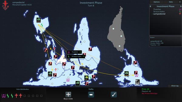
This is a screenshot from Neocolonialism, a videogame designed to make you feel very uncomfortable.
The premise is fascinatingly awful: a game of global domination, but where the aim isn’t to rule the world - it’s to liquidate it. You take over countries so you can sell them for cash at the end, making yourself as rich as possible while washing your hands of the consequences. Perhaps a better name is Sociopathic Billionaire Simulator.
This is, of course, making a point about how wretchedly unjust geopolitical power struggles can be - and it extends to the map itself, which seems to use a Gall-Peters Projection, sacrificing the correct shapes for countries to accurately show how big they are compared to each other.
Take a good look at it. Where are you in there? How important does that make you feel?
There’s a lot of interesting things to see here. Look at how South America is in fact South-East America, if you flipped it round. Look at how completely Africa’s size swamps Europe’s. And look at how detached and inconsequential it makes the so-called Western World look.
It’s saying “hey, you in the rich, self-congratulating north: how about you ****ing get over yourself?”
It’s an understandable criticism. Like the Han Dynasty Chinese, modern humans have a tendency to put the “important” people (often defined as themselves) at the tops of their maps. The industrialised, wealthy folk. The ones who are encouraged to habitually look down on the others in every way, including topographically: it seems we’re also biased to see places up our maps as higher.
(Try imagining the bottom of the Neocolonialism map as one big mountain-range and see how oddly wrong it feels to your brain. Or maybe it doesn’t, if you’re not from the northern hemisphere! If that’s the case, tell me about it in the comments, I’d love to know.)
Because of the recent global dominance of north-facing maps, this bias is baked into our minds. It’s now unthinkingly normal for us to say “up north” and “down south” (along with “out west” and “back east”, if you’re in the U.S.) - and start making social assumptions based on each. When Billy Joel sings Uptown Girl, we instantly understand that she’s from a posher part of town compared to him:
You know I can't afford to buy her pearls
But maybe someday when my ship comes in
She'll understand what kind of guy I've been
And then I'll win...
North is all about money and power (and religion and politics), and South is all about a lack of those things. At least, according to the people who first had the money and power to pay for those maps to be drawn up! They were financially sponsoring a world view - one that subtly discriminated against other places, thrusting them down the map towards assumed irrelevance, squalor and perdition.
(Many real-world exceptions to this bias now exist: for example, the United Kingdom, where we in the north are seen as the relatively muck-spattered unsophisticates - but hey, since when did humans let reality get in the way of a good irrational prejudice?)
To counteract this woeful pattern of psychological warfare against the 12% of the human race that lives in the southern hemisphere, I have a ridiculous proposal:
We flip half our maps upside-down.
Let’s say you decide to take a land-journey from the United States to the tip of South America. This is one hell of an adventure and are you sure you’ve actually, seriously, properly looked at the map? Please do that now. Perhaps sleep on it too (the idea, not the map). And then contact Andrew, who actually did this journey a decade ago, and even got himself to Antarctica in the end of it. Make sure you watch his TEDx talk. And ask him about everything. Still keen? Excellent! On your head be it.
For the first part of your journey down to South America, all your maps will be what a Westerner like me would call “the right way up”. But when you cross the equator in Colombia, Brazil or Ecuador, you’re given new maps, rotated through 180 degrees. You’re still heading towards the South Pole - but now, that means you’re going upwards.
Now you’re seeing the world like the Uruguayan artist Joaquín Torres García, in this deliberately provocative sketch he made in 1943.
It’s reorientation as a blow against prejudice, even oppression. As this article says, “it isn’t too much of a stretch to think that people are less likely to care what happens in countries or regions that are ‘lower’ than them on the map or globe.”
And maybe that also goes for feelings of national self-worth. Is it fair for any country to be geographically regarded as “the lowest of the low,” as Chile, Argentina and Australia are? How would a south-upwards map of the “bottom half” of the world change the way we treat each other and see ourselves?
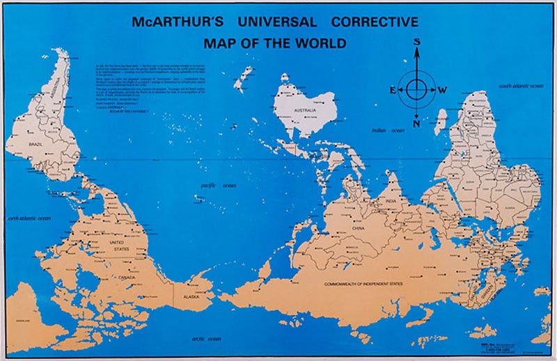
Or we could just throw all caution to the wind, as Melbourne University student Stuart McArthur did, and turn the whole damn thing upside-down for good:
(This map, launched on Australia Day in 1979, has now sold over 350,000 copies.)
However you choose to see the world, never forget that it’s a choice. Maybe not exactly yours, for practical reasons, but certainly someone’s, at some point in time.
And if that’s true, what other elements of our “basic common sense” views of the world are up for grabs, if we choose to look at them a bit differently? It’d be fun to find out.
Images: Shot By Cerquiera, typo-commonswiki/Wikimedia, Caleb Woods, Subaltern Games LLC, Honey Yanibel Minaya Cruz.
Barmy, right? You might also enjoy what’s behind the paywall, including a piece on the Great Pangean Mountain Trail (thousands of miles longer than the mighty Appalachian Trail) and the story of that time when a lot of New Yorkers became convinced there were goats on the Moon…
From now until September, all paid subscriptions to Everything Is Amazing are 10% off.
This will give you access to all those paywalled articles (like this recent one about a seemingly hollow mountain in the Himalayas); free access to the upcoming, revamped version of my non-fiction storytelling course (the first draft of which existing paid subscribers went through last year); chapters from my also upcoming first book How To Be Rained On; and a 1-to-1 ‘curiosity call’ to motivate you to chase your own weird-but-thrilling obsessions, as I explained here.
You’ll also be helping this thing survive. Starting this newsletter was an experiment, which quickly turned into the most fun thing I’ve done in my career to date. I have big plans for it - but they’re 100% dependent on reader subscriptions. If you’ve enjoyed this newsletter so far, going paid is the best way to help me keep it going and growing - and any kind of paid subscription would mean the world to me.
Click below to sign up, get a 10% discount & help keep this thing alive!


