Hello!
Into week 3 of Everything Is Amazing we stumble - and to start things off, I’m returning to those strangely non-exploding helicopters I mentioned in the first week.
You may be wondering what the hell all this is. Bless you! That’s at least two of us then. But in essence, you’re reading a newsletter about applied curiosity (yes, it’s all a bit weird really). Click below to get it when it’s hot:
Right then. Let’s take a look at the dangerous business of taking a look.
In the first week of this newsletter, I set myself the challenge of understand how my colourblind aircraft-engineering dad managed to not just get into the British Royal Air Force in the first place, but also spend the rest of his career, (to the best of my knowledge) not getting his wires crossed at critical moments - which might have ended really, really badly.
As so often happens with applied curiosity, this initial inquiry turned out to be the least interesting question I could have asked.
I started by speaking on the phone to a very accommodating retired technician who worked in the RAF in the 1960s.
(Far too late, I remembered a friend’s brother was more recently stationed there - and I should have remembered, because we both went to visit him in Cyprus in 2006. Always self-audit the connections you already have before seeking new ones!)
The answer to How Did My Dad Pass The Entrance Exam? Well, in the RAF in the 1960s they were indeed filtering applicants for colour-blindness, going back at least as far as 1943, according to this personal account. For the job he did, he shouldn’t have been able to pass the interview.
And yet he clearly did.
This suggest either wily shenanigans on my dad’s part - or a certain looseness in interpreting these rules that seems to have existed to ensure a healthy intake of new recruits? It’s possible he was allowed to show it wouldn’t be a problem, and based on the strength of his other skills, that was an acceptable way to proceed until he proved himself.
Or - it was known within the RAF, as it was known in the other British Forces, that while colour-blindness was technically a disability for recruitment purposes, it was also, in certain circumstances, an enviable superpower. More about that shortly.
So what about How Did My Dad Not Blow Everyone Up?
Take a look at this:
You’re looking at the Rolls-Royce Gnome turboshaft engine - originally developed by de Havilland to meet an American design. It’s the engine that powered both the Westland Wessex and Westland Sea King helicopters that my dad worked on.
Note the colours of its wiry innards. Mainly, the distinct lack of them. Yes, there are bright red caps on pipes in there - but the wiring is almost completely in shades of grey.
If the dangers of colour-blindness in aircraft engineering had been known about since at last the 1940s, aircraft manufacturers had decades to put something in place to minimise this problem that affects around one in ten men (and is more pronounced in Caucasians - nobody knows why). They needed a no-brainer of a solution in place here.
The answer was obvious. Don’t use colour to identify between engine parts. Or if you do, you also make that difference clear in at least one other way that doesn’t rely on colour.
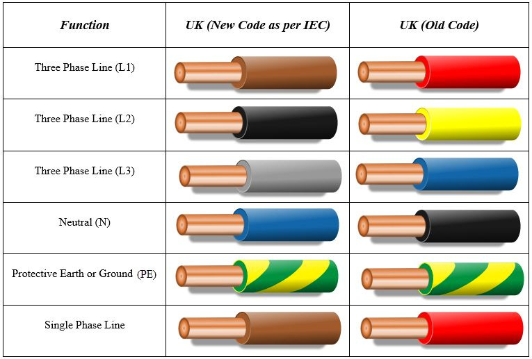
This begs a wider question: if this was widely understood in the Forces so early in the last century, why on earth did the UK still keep using red and green in its domestic electrical wiring?
It was only in March 2006 that Britain finally changed the colours of its wiring to completely remove red from the lineup. However, the official reason was “to harmonise the UK wiring colours with European cable colours for consistency and to avoid confusion.”
(Oh, those meddlesome Europeans and their…more sensible, rather safer wiring colour choices.)
Unfortunately - but also for understandable practical reasons - the new legislation didn’t require for existing wiring to be replaced with the new colours, so that still left a huge amount of old British wiring in place. Wiring you can’t see the colour of and you also don’t know if it’s the old or the new type? This is why we still don’t have colour-blind electricians.
(If you were ex-RAF and used to largely monochrome wiring, and decided to take your electrical skills into the domestic market, you must have found all this absolutely baffling.)
Anyhow. Let’s talk superpowers.
Being colour-blind in the modern world is a life of tiny, infuriating annoyances. For example, if you can’t see green, it’s much harder to tell whether a banana is ripe or not, because we intuitively use the colour of the stems as a cue:
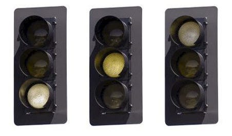
Or how about reading traffic lights at a glance? It’s not such a fast process for the colour-less-aware. They have to count.
(Both these images are from this excellent overview of the issues.)
But there is one way where the colour-blind seem to have a distinct advantage over us trichromats (standard-visioned folk) - and it takes us back into the military.
The dominant colours for military camouflage are green for vegetation and sandy beige for desert conditions. This seems to apply worldwide, except for a few exceptions (what the actual hell, China). But if you have red-green colour blindness, you don’t see green or beige. You see shades of another colour - with highly unusual sensitivity, it seems.
A study by biologists at Cambridge University and the University Of Newcastle Upon Tyne found that colour-blind men were “extraordinary connoisseurs of khaki.” Many anecdotes exist about the US Army’s preference for colour-deficient snipers and spotters during WW2, because of their ability to spot subtle shades and patterns against a jumbled background. And an article in Nature in 1940 said this:
”Superficially, therefore, it would seem highly improbable that colour-blind persons could detect a camouflaged building that an ordinary observer would miss. This suggestion, however, which has come from the United States recently, is not wholly without foundation, as there are at least three ways in which certain colour-blind observers might see more than the ordinary person. For example, in a building camouflaged with large irregular patches of colour, the actual outline of the building may be lost in the jumble of these patterns. But the colour-blind person may be scarcely conscious of the variegated colours, so that to him the outline of the building may be almost unaffected by the camouflage.“
All this makes me wonder: did the US Army make this guy colour-blind as well? Because it’d certainly make sense.
The final rabbithole I threw myself down here was into the world of user interface design (UI).
I had the very good fortune to pick the brains of Zak, Lead Product Designer at RiptideIO and Head of Product at Prismatext. It is Zak’s job to think about colour in a way very few of us do - because his target audience is absolutely everyone.
To design a user interface for something online - aka. making The Bit You Use To Click On And Type Things Into - you have to make something that is equally visually comprehensible to everyone. If anything looks confusing, the client you’re designing it for could lose clicks, meaningful engagement or a worrying chunk of their revenue (or all three).
This therefore means designing for colour-blind people. Not by removing colour altogether, because that’s a key part of every designer’s arsenal of attention-grabbing techniques - but by using it in a secondary way, in tandem with other visual design elements.
Take this toolbar, which we’ve all become oh-so-familiar with over the last year:
Yes, Zoom uses red for “End Meeting” and green for “Share Screen” (and a bit of red to denote disabled features) - but you don’t have to rely on it, because of the super-obvious word labels. That’s good design at work, that is.
To start to get my head around the ways colour can be experienced and used, Zak pointed me towards this mindblowing Radiolab episode. I recommend it heartily to you (along with…every other Radiolab episode, as it remains the greatest podcast ever created).
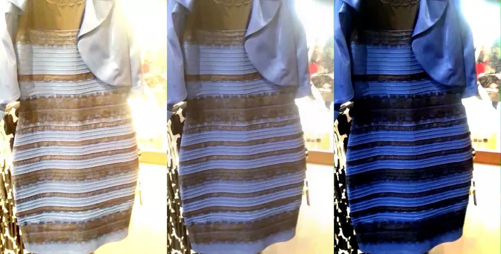
What Zak impressed on me was the fact that each of us sees our own version of what we collectively call “colour”. Our eyes work just a little differently to each other’s - meaning, say, the blue I see in the sky may not quite be the blue you see, even though we both use the same word for it.
You may remember this being illustrated in dramatic fashion back in 2015, when the entire online world lost its mind over the colour of a dress.
(For a non-colour example of feeling like you suddenly don’t understand how other people work at all, take a look at the surprisingly common neurological state of aphantasia - where some people lack a functioning mind’s eye. It’s worth noting that to aphantasiacs, this seems so normal that when they discovered other people could create imaginary pictures inside their heads, it completely rocked their world.)
Another factor: consider the way that our technology itself shows colour. There is, for example, a big difference between a colour on a printed page vs. a colour shown on a computer screen - and another big gap between different screen types and between different inks on paper.
All this adds up to a startling fact. In a subtle but profound way, all of us aren’t on the same page. Or the same screen either. When it comes to colour, my Besžel is your Ul Qoma, and neither of us is aware there’s any difference.
So what else don’t we know about here?
There’s just so much here. I could keep going for days.
But I hope you can see what happened here. I attacked a fairly simple question from a number of angles, and what I ended up with - were much better, much more interesting questions.
(Oh, and an answer too! I forgot about that bit.)
This is the essence of a really good deep dive. The solution you were initially seeking is OK, good to know, whatever, but WHAT ABOUT THAT OTHER THING RIGHT, and instead of feeling like a puzzle solved, it has all turned into a mystery deepened. The amount you can learn, and the fun you can have in the world, has magically increased…
And all you had to do was look hard enough.
On Wednesday, I’m returning with some weird science - and on Friday, your third load of challenges will pile into your Inbox in a hot, sweaty mess.
How are you getting on with the current batch?
And sometime soon, I promise I’ll be brave enough to show you what a pile of foetid dingo’s kidneys I keep making when I draw Scotland from memory. (Not today. I figured this email was plenty long enough already.)
But for now, I will end with this British song from 2002, which reminds me of my university days - specifically, the urge to drink whisky until I was incapable of hearing the radio. Enjoy!
Images: Robert Katzki; Marvel Studios; Wikimedia Commons;


