Hello! This is Everything Is Amazing, a newsletter about science, curiosity and wonder - and using the right kind of stupidity to have a really great year.
First up: a few newsletters back, I mentioned a BBC news story about children from low-income families who couldn’t afford school dinners right now, and how it made me want to do something about it. Well, I’m thrilled to say I was only one of hundreds of folk who sent a donation to the school - and now all the kids at Dixons Marchbank Primary in Bradford will be getting free lunches for the rest of the year.
It’s just the nicest thing - and a reminder that any time you see something grim in the news, its international visibility in that news story could be just what’s needed to tackle the problem.
(I’ve previously said some critical things about negativity bias in the news, but when you see something like this happening, it’s a reminder of all the good a news story can do. Whew.)
Okay!
This season of this (non-)newsletter, we’ve been looking at colours: what they are, how they work and how we use them to do all the bafflingly human things we do.
But here’s a basic question for you: who gets to decide what they’re called? Or, putting it another way: why can’t we just make our own (or is that silly)?
Well, we can make our own - and it can get incredibly silly.
It’s the 1570s, and English clergyman William Harrison, finding himself at a loose end, starts writing an account of how utterly absurd everything is.
The book he’s writing become a classic of its time: a vast, deep slice of everyday Elizabethan life, just before the arrival of Shakespeare. He’s attempting to sum up the entire country’s geography, economy, society, religious and political landscape for future historians, for inclusion in a much larger volume - and it’s to his credit that hundreds of years later it remains not just readable but entertainingly wry and opinionated.
And nothing perplexes him more than modern English fashion:
“…as these fashions are diverse, so likewise it is a world to see the costliness and the curiosity, the excess and the vanity, the pomp and the bravery, the change and the variety, and finally the fickleness and the folly, that is in all degrees, insomuch that nothing is more constant in England than inconstancy of attire.”
It’s a bewildering mess, he concludes - and mostly the fault of those wretched dressmakers, whom in catering for and feeding the delusions of “fantastical heads” are resorting to the most idiotic forms of invention imaginable. Including, of all things, colours! They’re actually inventing new colours, in an attempt to hoodwink more rich fops into handing over their cash.
These ‘exclusive’ new hues include:
gooseturd green (self-explanatory, particularly if you’ve spent time around geese)
peas-porridge tawny (named after a stodgy sort-of-soup made from split yellow peas with the thickness of stale hummus)
popinjay blue (perhaps a joke at the expense of the buyer, since a popinjay is a vacuous, conceited Bertie Wooster type who never shuts up)
the-devil-in-the-head (perhaps mercifully, we don’t quite know what this looked like, but since it went by the alternate name of hedge it’s easy to imagine a kind of verdant, putrescent green)
…and lusty gallant, a pale, coral-pink red.
Lusty Gallant is also the name of a popular Tudor dance, set to 6/8 or 4/4 time and forming the basis for a great many ballads. It’s not clear how it became recognised as a colour (a fairly weird prospect: imagine if we had colours called Bohemian Rhapsody or Spice Up Your Life?) but for some reason it stuck, and lingers to this day.
(For colour nerds: the Hex Color code for Lusty-Gallant is #ffcccc, and the RGB color code is RGB (255,204,204)).
It’s 2017, and optics research scientist Janelle Shane finds herself at a loose end. What would be both a credible piece of research and a hilariously dumb use of her programming skills?
Ah! Of course. How about teaching her neural network to act like an Elizabethan dressmaker, by inventing a bunch of new colours from scratch?
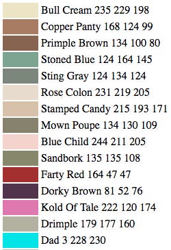
"For this experiment, I gave the neural network a list of about 7,700 Sherwin-Williams paint colors along with their RGB values. (RGB = red, green, and blue color values.) Could the neural network learn to invent new paint colors and give them attractive names?"
The answer is a fairly emphatic “No”:
You want more? Sure thing.
I mean, I could just keep posting more of these for the rest of this newsletter, and I reckon both of us would be pretty happy about it. But I’d better not.
Okay, fine, just one more:
(Rejoice, fathers of the world! Do you take great delight at Christmas in delivering your “dad jokes,” as the younglings now call them? Never tire of seeing their joyful little faces collapse into glassy-eyed horror? Now you have your very own colour - “Dad” (3 228 230) - just to hammer the whole thing home. I just know there’s a shell-suit somewhere out there that’d do the job nicely.)
For more of this kind of machine-derived fun, read Janelle Shane’s blog AI Weirdness, or read her book You Look Like A Thing And I Love You: How Artificial Intelligence Works and Why It’s Making the World a Weirder Place.
It’s December 2022, and an idiot in Scotland is at a loose end, so he starts to wonder, “Hey, could I invent my very own colour?”
After all, he recently learned that in so-called normal (trichromatic) human vision there are over a million visible colours, and if tetrachromacy really is a thing in a practical sense, you could factor that number up by another hundred! And also, he dimly remembers: aren’t there way more than a million possible colours using the Web-based Hex system?
Correct. The 24-bit interplay of red, green and blue that we see on our screens has 16,777,216 possible combinations, each having its own specific Hex code.
But surely they can’t all have names? The Oxford English Dictionary says there are only around 178,000 words in common usage, and another 50,000 that are now archaic and/or defunct.
He thinks: Doesn’t that mean that potentially there are millions of us who, with a bit of effort, could get a colour named after us?
He decides to write a newsletter about this.
This is Medium Blue (Hex #0000CD - 0% red, 0% green and 80.4% blue).
It reminds me of the sky on a hot day - not too hot, just a slight cool breeze in the air, enough to ruffle your eyebrows and caress your neck, and the sun’s off at an angle so it’s not dazzling your eyes. It reminds me of the sea in Greece, where I spent a wonderful couple of months in 2019 and want to return to as soon as possible. It’s a blue that calls up my memories of living in Cyprus as a kid. It’s a colour, therefore, that says a lot to me, both via the head and through the heart.
Now, obviously I can’t just steal this colour and call it my own. It already has a name! So getting everyone to agree to change that name would be unethical a lot of work!
I mean, my worst case scenario here would be to exert the same kind of effort as the Dutch artist A. Boogert did in 1692, when he wrote a 900-page (!) book of colours as a guide to artists, showing them how to mix every possible colour they’d ever contemplate using. It was an incredible piece of work - and, it seems, utterly wasted on the world, as there was only ever one copy and hardly anyone read it.
(Hat-tip to Andrew of the superb Histories newsletter for making me aware of this gut-wrenching tragedy of a thing.)
So here’s what I’ll do instead.
This is Sowden’s Bane (Hex #1000CE - 6.3% red, 0% green and 80.8% blue).
As you can see it’s a quite remarkably different shade of blue than the previous one, and hopefully all the work I’ve put into crafting that difference is self-evident. (It’s been a lot of sleepless nights.)
I have extremely high hopes for Sowden’s Bane. I think it could change the world, if only it caught on.
But - how? How can I make that happen?
What would be really terrific is that one of you reading this newsletter is the CEO of Pantone LLC, based in Carlstadt, New Jersey. It’d really help my case to have Sowden’s Bane appear in the incredibly influential Pantone Color Matching System, used by designers the world over. Please hit Reply if that’s you, so we can get things rolling.
But wait - would that help me? The Pantone chart is an offline way of depicting colour, using the CMYK (cyan, magenta, yellow, and black) method of physically printing colours. Hex is only online. So does that mean Sowden’s Bane is doomed to stay online?
The answer’s almost certainly yes. Pantone’s system only has 2161 named colours - compared to Hex’s 16+ million. If I wanted to get my colour officially named over there, I’d have to fight it out with roughly 7,764 other shades of … whatever Pantone calls “Medium Blue”. I’d have to defend my creation from thousands of narrow-minded fools who lack the vision (in every sense) to see just how incredibly different Sowden’s Bane is from the popular variety of blue it’s just over 1/16-millionth of the Hex spectrum away from.
Again, that just sounds like a lot of work. The kind I’d probably have to do myself? No, then.
But wait. What about bullying people into using it? Maybe I could just litigate my way through this tedious obstacle. (I gather that’s an excellent way to proceed when everyone’s otherwise ignoring you!)
How could I do that? How could I trademark Sowden’s Bane(™) and - reluctantly and apologetically, of course - threaten people into giving me money every time they use it?
“Singular colors and color combinations can be trademarked as part of a product, package or service, if, like any other trademark, they (1) serve a source identification function, and (2) do not serve a merely decorative or utilitarian purpose.
Examples of protectable color marks include: red soles for women’s high-heel dress shoes, where the rest of the shoe is not also red (Louboutin); pink fiberglass insulation (Owens-Corning); red knobs on cooking appliances (Wolf); light blue for jewelry boxes (Tiffany); brown for parcel delivery trucks and uniforms (UPS); magenta for telecommunications services (T-Mobile); and orange for scissor handles (Fiskars).”
- Michael Bernet, IPWatchdog
Sigh. It appears you can only trademark a colour if that colour is already strongly associated with an already popular thing. I would therefore need to make Sowden’s Bane a popular colour of choice on an already popular item in today’s world, and only then might I have a case for trademarking it. As it stands, not so much.
Okay. But what about existing colour names? How did they get a foothold, and is there any way for me to learn from (and by that I mean “steal”) their route to success?
In the 1960s, UC Berkeley linguists Brent Berlin and Paul Kay started collecting colour-naming data from 20 different languages, to see if they could find a pattern.
Their findings seemed to confirm those proposed by Francis A. Wood more than half a century earlier: by and large, there seemed to be a standard order in which named colours creep into languages:
“If a language had six basic color words, they were always for black or dark, white or light, red, green, yellow, and blue. If it had four terms, they were for black, white, red, and then either green or yellow. If it had only three, they were always for black, white, and red.”
If this was true - and their initial finding certainly pointed in that direction, although it became less clear-cut with a larger dataset - why, when we live in a natural world that seems dominated by blue and green, do those colours appear to be much slower to make an appearance in our spoken and written language? Why, in particular, was blue so relatively unpopular, when our skies are blue and we live on a planet that’s more than two-thirds that colour, not just from space, but at ground (or rather sea) level, too??!
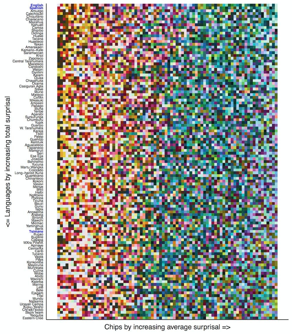
In 2017, two research groups - the Language Lab at MIT and the NIH Intramural Research Program - took a deeper look. Using a grid of Munsell colours (which I used on archaeology digs to tell what colour a soil deposit is), they looked at how easy it was for someone to communicate particular colours using language - the full experiment is a little complicated, so I won’t labour it here, but their conclusion was:
“In English, it turns out that people can convey the warm colors – reds, oranges and yellows – more efficiently (with fewer guesses) than the cool colors – blues and greens.”
In this chart, the colours to the left are the ones the subjects found easiest to communicate (they required the least time to verbally pinpoint) and the ones to the right were harder to guess. Therefore, with every language, the ‘warmer’ (redder) colours were easier to describe, and the ‘cooler’ ones - the blues and greens - were harder to nail down with words alone.
Okay, but - why?
“Recall that our idea is that maybe we introduce words into a language when there is something that we want to talk about. So perhaps this effect arises because objects – the things we want to talk about – tend to be warm-colored.
We evaluated this hypothesis in a database of 20,000 photographs of objects that people at Microsoft had decided contained objects, as distinct from backgrounds. (This data set is available to train and test computer vision systems that are trying to learn to identify objects.) Our colleagues then determined the specific boundaries of the object in each image and where the background was.
We mapped the colors in the images onto our set of 80 colors across the color space. It turned out that indeed objects are more likely to be warm-colored, while backgrounds are cool-colored. If an image’s pixel fell within an object, it was more likely to correspond to a color that was easier to communicate. Objects’ colors tended to fall further to the left on our ranked ordering of communicative efficiency.
When you think about it, this doesn’t seem so surprising after all. Backgrounds are sky, water, grass, trees: all cool-colored. The objects that we want to talk about are warm-colored: people, animals, berries, fruits and so on.”
If I’m understanding this correctly - the argument here is that ‘objects’ (including human-made things, or to put it archaeologically, material culture) have a tendency to be warmer-coloured than ‘background’ (including what we’d call “natural”) things.
It’s speculative, but impressively universal. All 110 languages featured in the study appeared to display this bias!
So this seems (seems) to be a big part of how colour names take hold and endure in human language. We love talking about warmer colours because on the whole, we tend to colour all our stuff the same way, towards the red end of the spectrum. It’s a human thing.
In other words, by picking a subtle shade of Medium Blue to make my own, I have already loaded the dice against myself before the first roll.
So as I fling my laptop away from me in disgust, that’s my tip for you on this topic: if you want to be famous hundreds of years from now, name a dance after yourself, or perhaps a pair of outrageously priced trousers - and leave the colour-naming to the machines, so when future generations look back at all this madness, at least they can have a bloody good laugh about it.
Further Reading
“Languages don’t all have the same number of terms for colors – scientists have a new theory why” - Ted Gibson/Bevil R. Conway, The Conversation.
Images: Ars Technica/Janelle Shane; Scott Evans; Ted Gibson/Bevil Conway.


A couple of new color names followed the release of the movies, Gone With The Wind and My Fair Lady: Lawdy Miss Scarlet, and 'Enry 'Iggins Just You White.
Please note that I am filing a cease and desist order over your use of Sowden's Bane as it is utterly indistinguishable from Jensen's Jazz, soon to be in Chanel's Spring Color collection thereby making me very rich.
Perhaps you could do something more with Bank Butt.